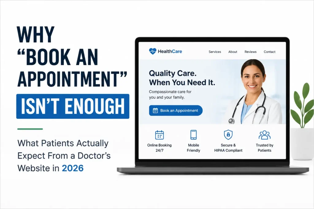
Most practice websites have a “Book an Appointment” button somewhere near the top. It feels like enough. The site looks clean, the button is visible, and patients can technically get in touch. Case closed, right?
Not quite. That button creates a false sense of security. It tells you the site has a call to action, but it says nothing about whether that call to action actually works the way patients expect it to in 2026. A button that opens a static contact form, or worse, just displays your phone number, isn’t booking software — it’s a mild inconvenience wearing the costume of convenience. And patients today notice the difference immediately, even if they can’t articulate exactly what feels off.
Meeting real patient expectations for a doctor website requires looking past the button and at everything underneath it: how fast the site loads, how it works in someone’s hand at 11 p.m., how safe their information feels, and how much it actually looks like a place that will take care of them. Here’s where most practice websites are quietly falling short — and what closing those gaps actually looks like.
Booking Friction Is Costing You Patients You Never Even Hear From
The biggest misunderstanding about online booking is treating it as a convenience feature rather than a core part of patient acquisition. A “request an appointment” form that requires your front desk to call back the next business day isn’t real booking. It’s a delayed maybe.
Patients researching a new doctor rarely do it during office hours. They’re searching after a bad night’s sleep, during a lunch break, or right after a symptom starts worrying them. If your site can’t confirm a real appointment slot on the spot, a meaningful share of those visitors — often estimated between 30 and 40 percent — simply move on to a practice that can. They don’t call to complain. They don’t leave feedback. They just quietly choose someone else, and you never know the opportunity existed.
This is the core promise of true online appointment booking software: real-time availability pulled from your actual schedule, instant confirmation, and zero phone calls required unless the patient wants one. For a practice, this isn’t about replacing your front desk — it’s about not losing patients before your front desk ever gets involved.
Speed Isn’t a Technical Detail — It’s a Conversion Metric
Here’s a number worth sitting with: every additional second your website takes to load measurably reduces the number of visitors who take action. Not eventually. Immediately. The best-performing medical practice websites in 2026 load in under two seconds, and that isn’t a coincidence — it’s a design priority.
Think about who’s actually visiting a doctor’s website. They’re often not casually browsing. They’re worried, uncomfortable, or trying to solve a problem quickly before something else demands their attention. A slow-loading site doesn’t just annoy that person — it actively works against the trust you’re trying to build in the first few seconds of contact.
Speed also compounds with search visibility. Search engines weigh load time as part of how they rank pages, which means a slow site doesn’t just convert worse — it shows up less often in the first place. For a practice competing for local search terms, that’s a quiet, ongoing loss of potential patients who never even see the listing.
Mobile Isn’t a Version of Your Site — It’s the Main Event
Roughly two-thirds of healthcare-related searches now happen on a phone. That statistic alone should reframe how a practice thinks about its website. Mobile isn’t a secondary experience to accommodate after the “real” desktop site is finished. For most patients, mobile is the only version of your site they will ever see.
And the context matters. Someone searching for a doctor on their phone is often doing it in a moment of discomfort or urgency — in a waiting room, at 2 a.m. while a child has a fever, or between meetings because a symptom has started nagging at them. That person does not want to pinch, zoom, or hunt for a phone number buried in a footer. They want large, obvious tap targets, a booking button that’s reachable with a thumb, and information that loads instantly on average mobile data, not just office WiFi.
A mobile-first healthcare website isn’t a nice-to-have anymore — it’s the baseline expectation, and practices that treat mobile as an afterthought are quietly filtering out the majority of their own traffic.
Compliance and Trust Are the Same Conversation
Patients may not consciously think about HIPAA compliance when they land on your website, but they absolutely notice the signals that come with it, even if they can’t name them. A secure connection, a professional-feeling contact form, and the general sense that a site “feels legitimate” all factor into whether someone is willing to hand over their name, phone number, or reason for visiting.
Any form collecting patient information needs to be encrypted and properly secured — this is a baseline legal requirement, not an optional upgrade. But beyond the legal obligation, HIPAA-compliant website forms serve a second purpose: they’re part of the trust equation. A visitor who senses, even subconsciously, that a form feels sloppy or insecure is far less likely to complete it, regardless of how good your care actually is.
Trust also needs to show up immediately, not after several clicks. Credentials, real photos of your actual providers, and genuine patient reviews should appear above the fold on your homepage, not buried three pages deep on an About Us page nobody finds. Patients are trying to answer one core question in the first few seconds on your site: can I trust these people? Everything about your design should be working to answer that question quickly and honestly.
The Sterile Look Is Working Against You
For years, medical websites defaulted to a familiar visual formula: clinical white backgrounds, cool blue accents, and stock photography of generic people in white coats. It read as “professional,” but it also read as cold — and coldness is the opposite of what an anxious patient needs to feel before booking.
The design direction in 2026 has shifted toward warmth without sacrificing credibility. That means calmer color palettes beyond the standard hospital blue, generous white space that reduces visual clutter and cognitive load, and — most importantly — real photography of your actual providers and clinic space instead of interchangeable stock images. Patients can spot stock photography almost instantly, and it quietly undermines the very trust a healthcare website is supposed to build.
This isn’t about chasing a trend for its own sake. It’s about recognizing that a stressed, uncertain visitor responds differently to a site that feels human than one that feels like a hospital corridor. Design tone is an emotional decision as much as an aesthetic one.
Let Your Website Answer Questions Before the Phone Rings
A well-built practice website should be reducing your front desk’s call volume, not generating more of it. Clear, plainly written service pages, condition explainers, and FAQ sections let patients self-serve the information they’re looking for — what a procedure involves, what to expect at a first visit, whether their insurance is likely accepted — without needing to call and wait on hold.
This does double duty. It frees your staff to focus on patients who need direct help, and it builds trust before the first conversation even happens, because the patient already feels informed. A site that only says “call us to learn more” for every question is quietly pushing away patients who wanted to do their own research first, which is most of them.
Your Website Is a Digital Front Desk, Not a One-Time Project
It’s worth remembering that a website isn’t something you build once and leave alone. A site that hasn’t been updated in over a year sends a quiet signal — to patients and to search engines alike — that a practice may not be actively managed. Provider information changes, insurance panels shift, services expand. Treating your website as a living, quarterly-maintained asset rather than a “set it and forget it” brochure keeps it working as hard as your front desk does.
Ultimately, that’s the right way to think about a practice website in 2026: not as a digital business card, but as the first member of your care team that every patient interacts with. If it’s slow, cold, or hard to use on a phone, it’s quietly turning people away before you ever get the chance to help them.
If you’re not sure whether your current site is meeting these expectations, a straightforward audit — checking load speed, mobile usability, booking friction, and overall trust signals — is usually the fastest way to find out. We’re happy to take a look.