Most business owners find out the hard way that a beautiful website and a high-converting business website are not the same thing. You spend months on a redesign, the new site looks sharp, everyone on the team loves it — and the phone still doesn’t ring any more than it did before.
That gap between “looks good” and “brings in business” is where most websites quietly lose money. After years of building and auditing WordPress sites for small businesses, agencies, and local service providers, the pattern is almost always the same: the problem isn’t the design. It’s the missing structure behind the design — the trust signals, the clarity, the calls-to-action, the speed, the small decisions that either move a visitor toward contacting you or give them a reason to leave.
This guide breaks down exactly what separates a site that converts from one that just sits there looking pretty. You’ll get the psychology behind visitor decisions, the specific features every page needs, the mistakes that quietly kill conversions, and practical checklists you can use to audit your own site today.
What Is a High-Converting Business Website?
A high-converting business website is a site where a meaningful percentage of visitors take the action you want — calling, booking, filling out a form, or buying — instead of leaving without doing anything.
It’s not about traffic volume. A site with 500 visitors a month and a 6% conversion rate outperforms a site with 5,000 visitors and a 0.5% conversion rate, every time, because it’s actually turning attention into revenue.
Conversion isn’t one thing. It’s the sum of dozens of small decisions: how fast the page loads, how clear the headline is, whether the CTA button is visible without scrolling, whether a visitor trusts you enough to hand over their phone number. Get enough of those small decisions right, and the whole site starts working harder without a single extra visitor.
Why Conversion Matters More Than Traffic
Most business owners chase traffic first. That’s backwards.
Here’s the thing: if your website converts at 1% and you double your traffic, you double your leads. But if you improve your website conversion rate from 1% to 3%, you triple your leads with the exact same traffic — no ad spend, no extra SEO work, no extra content.
Conversion rate optimization is almost always the cheaper, faster win. Traffic gets you visitors. Conversion turns visitors into customers. A site redesigned around conversion principles typically sees results within weeks, while traffic growth from SEO can take months.
This doesn’t mean traffic doesn’t matter. It means fix the leaks in the bucket before you pour more water in.
Understanding Visitor Psychology
People don’t read websites the way they read books. They scan, judge, and decide in seconds. Understanding what’s going through a visitor’s mind in those first moments is the foundation of website conversion optimization.
Trust
Visitors are asking, often unconsciously: “Is this a real business? Can I trust these people with my money or my problem?” Every trust signal you show — reviews, certifications, real photos, a real address — chips away at that hesitation.
Clarity
Confused visitors don’t convert. If someone lands on your homepage and can’t tell what you do or who you do it for within five seconds, they’re gone. Clarity beats cleverness every time.
Simplicity
Too many choices create decision fatigue. A page with one clear next step converts better than a page with ten competing options, links, and buttons all fighting for attention.
Speed
Slow websites signal an unprofessional business, even if that’s unfair. Every extra second of load time chips away at patience and trust before the visitor has even seen your content.
Confidence
The copy, design, and structure of your site should project the same confidence you’d want a salesperson to have in person. Hesitant, vague, or overly formal copy makes visitors hesitant too.
Essential Features of a High-Converting Website
This is the core of what separates a conversion focused website from one that just exists online. Think of these as the non-negotiables.
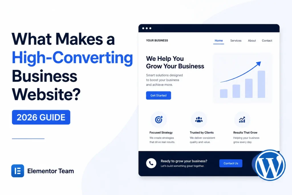
Clear Value Proposition
Your homepage headline should answer three questions in under five seconds: what do you do, who is it for, and why should I choose you. “Welcome to Our Website” answers none of them. “Emergency Plumbing in [City] — On-Site in 60 Minutes” answers all three.
Professional Hero Section
The hero section is the first thing visitors see. It needs a strong headline, a supporting line, a clear image or video, and a visible call-to-action — all without requiring a scroll.
Strong Call-to-Action
Every page needs one obvious next step. “Learn More” is weak. “Get a Free Quote” or “Book Your Consultation” tells the visitor exactly what happens next and why it’s worth clicking.
Mobile-Friendly Design
More than half of business website traffic is mobile in most industries. If buttons are hard to tap, text is too small, or forms are painful to fill out on a phone, you’re losing the majority of your visitors before they even see your offer.
Fast Loading Speed
Every additional second of load time increases the chance a visitor leaves before the page finishes rendering. If your website feels sluggish even on a good connection, Speed Optimization is one of the highest ROI improvements you can make, because it affects every single visitor on every single page.
Trust Signals
Badges, certifications, years in business, “as featured in” logos — these all quietly reassure a hesitant visitor that you’re legitimate.
Testimonials
Real testimonials, ideally with a name and photo, do more to overcome objections than any amount of marketing copy. Visitors trust other customers more than they trust you.
Google Reviews
Embedding your actual Google review score and count on your site adds third-party credibility that’s harder to fake than on-site testimonials alone.
Certifications
Industry certifications, licenses, and association memberships matter most in trades, medical, legal, and financial services, where trust is the biggest barrier to conversion.
Client Logos
If you’ve worked with recognizable brands or well-known local businesses, showing their logos borrows their credibility for your business.
Case Studies
A short case study — problem, solution, result — is far more persuasive than a generic list of services, especially for B2B and higher-ticket offers.
Portfolio
For agencies, designers, and contractors, visual proof of past work often matters more than anything you can write about yourself.
Easy Navigation
If a visitor can’t find your services or your contact page within two clicks, your navigation is costing you leads. Keep the main menu short and obvious.
Contact Information
Your phone number, email, and address should be visible, not buried three pages deep. Hidden contact details are one of the fastest ways to lose a ready-to-buy visitor.
Contact Forms
Short forms convert better than long ones. Ask for name, contact detail, and a brief message — save the deep-dive questions for the follow-up call.
Click-to-Call Buttons
On mobile, a tappable phone number removes friction entirely. This is especially critical for local and service-based businesses where a phone call is the preferred first contact.
Live Chat
Live chat (or even a well-configured chatbot) catches visitors at the exact moment they have a question, instead of letting them leave to search for the answer elsewhere.
FAQ Section
FAQs answer objections before they become reasons to leave, and they double as strong content for AI search tools and Google’s answer boxes.
Pricing Transparency
Even a rough price range reduces friction. Visitors often abandon a “Contact for Pricing” page because they assume it means the price is high or hidden.
Service Pages
Each core service deserves its own dedicated page, written for the specific visitor searching for that exact service, rather than one generic “Services” page trying to cover everything.
Internal Linking
Linking service pages, case studies, and blog content to each other keeps visitors exploring longer and helps search engines understand your site structure.
SEO Foundation
A high-converting business website still needs to be found. Clean URLs, proper headings, optimized meta titles, and useful content all support both rankings and conversions.
Core Web Vitals
Google’s Core Web Vitals measure real-world loading, interactivity, and visual stability. Poor scores hurt both search rankings and how the site feels to actual visitors.
Accessibility
Accessible design — proper contrast, readable font sizes, keyboard navigation — expands who can use your site comfortably and is increasingly expected, not optional.
Security
Visitors and search engines both penalize sites that feel insecure. Outdated plugins, broken login pages, or vulnerable forms erode trust fast. Website Security should be treated as an ongoing task, not a one-time setup.
SSL
An SSL certificate isn’t optional in 2026. Without the padlock icon, most browsers actively warn visitors your site isn’t secure — a fast way to lose a form submission before it’s even started.
Website Design Mistakes That Kill Conversions
| Mistake | Why It Hurts Conversions |
|---|---|
| Too many CTAs | Competing buttons create decision paralysis |
| Slow website | Visitors abandon before the page even loads |
| Confusing navigation | Visitors can’t find what they came for |
| Weak headlines | Fails to communicate value in the first few seconds |
| Poor mobile experience | Loses the majority of traffic on most sites |
| Stock photos everywhere | Feels generic and reduces trust |
| No testimonials | No social proof to overcome hesitation |
| Hidden contact details | Ready-to-buy visitors give up looking |
| Generic copy | Fails to differentiate from competitors |
| No trust signals | Visitors have no reason to believe you’re credible |
Homepage Checklist
- ✅ Clear headline answering what, who, and why
- ✅ Hero section with visible CTA above the fold
- ✅ Mobile-optimized layout
- ✅ Fast load time (under 3 seconds)
- ✅ Trust signals visible near the top
- ✅ At least one testimonial or review
- ✅ Clear, simple main navigation
- ✅ Visible phone number or contact link
- ✅ Internal links to key service pages
Service Page Checklist
- ✅ Dedicated page per core service
- ✅ Headline specific to that service
- ✅ Benefits explained, not just features listed
- ✅ Relevant testimonial or case study
- ✅ Clear CTA specific to that service
- ✅ FAQs addressing common objections
Contact Page Checklist
- ✅ Short, simple contact form
- ✅ Phone number and email clearly visible
- ✅ Business address (if applicable)
- ✅ Map embed for local businesses
- ✅ Business hours listed
- ✅ Alternative contact methods (chat, WhatsApp, etc.)
Landing Page Checklist
- ✅ Single, focused goal — no competing links
- ✅ Headline matched to the ad or campaign that sent traffic
- ✅ One clear CTA repeated at logical points
- ✅ Social proof close to the CTA
- ✅ No main navigation distracting from the offer
- ✅ Fast load time on mobile
Conversion Optimization Tips
Put your CTA above the fold. Visitors shouldn’t have to scroll to find out how to contact you — this removes the most common point of drop-off.
Use specific CTA copy. “Get My Free Quote” outperforms “Submit” because it restates the benefit at the exact moment of decision.
Shorten your forms. Every extra field reduces completion rates; ask only for what you need to make the first contact.
Add urgency where it’s honest. “Limited appointments this week” works because it gives a real reason to act now instead of later.
Show real photos, not stock images. Real team and workplace photos build trust that generic stock photography can’t, because visitors can tell the difference.
Test one change at a time. Changing the headline, CTA, and layout simultaneously makes it impossible to know what actually improved results.
Repeat your CTA on long pages. A visitor who scrolls past your first CTA without acting still needs a clear next step further down the page.
Real Business Examples
Local plumber: A click-to-call button in the hero section, paired with “Available 24/7” trust messaging, consistently outperforms a generic contact form for emergency service businesses.
Law firm: Case results and attorney credentials near the top of the homepage address the trust barrier that’s usually the biggest obstacle in legal services.
Medical clinic: Online booking widgets embedded directly on service pages remove the friction of a phone call for patients who prefer to book digitally.
Digital agency: Case studies with real numbers — not just “we improved their traffic” — convert far better than portfolio pages with visuals alone.
Construction company: Before-and-after project photos paired with a simple quote request form perform better than long-form service descriptions.
Restaurant: A visible menu, online reservation button, and real photos of the space and food outperform a homepage built mostly around brand storytelling.
E-commerce store: Clear shipping and return policy information near the “Add to Cart” button reduces cart abandonment driven by uncertainty.
Elementor Tips
Elementor makes it realistic for a business owner to implement most of the above without hiring a developer for every change, but a few habits matter:
- Layouts: Use Elementor’s flexbox containers to keep hero sections and CTAs consistent across breakpoints instead of relying on default theme spacing.
- CTAs: Build CTA buttons as global widgets so wording and styling stay consistent across every page, and updates apply everywhere at once.
- Forms: Keep Elementor Forms short, and connect them directly to your CRM or email so leads are followed up on quickly.
- Testimonials: Use the testimonial or loop grid widgets to keep reviews visually consistent rather than pasting screenshots, which often look unprofessional on mobile.
- Landing pages: Build dedicated landing pages using Elementor’s landing page templates rather than repurposing the homepage — a focused page with no navigation distractions almost always converts better for paid traffic.
If your homepage feels outdated or was built years ago on an older page builder, a professional Website Redesign can dramatically improve conversions without starting from zero. And if your current WordPress setup is causing more problems than it solves, WordPress Support & Fixes can resolve the technical issues quietly holding your conversion rate back.
High-Converting vs Low-Converting Website
| Element | High-Converting Website | Low-Converting Website |
|---|---|---|
| Headline | Specific, benefit-driven | Vague or generic |
| Load speed | Under 3 seconds | 5+ seconds |
| CTA | One clear action per page | Multiple competing CTAs |
| Trust signals | Reviews, certifications, real photos | None or hidden |
| Mobile experience | Fully optimized | Desktop-first, awkward on mobile |
| Contact info | Visible everywhere | Hidden in footer or missing |
| Copy | Specific to the visitor’s need | Generic, one-size-fits-all |
Frequently Asked Questions
What makes a website convert better?
A website converts better when it combines clarity, speed, and trust. Visitors need to understand what you offer within seconds, the page needs to load quickly enough that they don’t leave, and trust signals like reviews and testimonials need to be visible early. Beyond that, a single clear call-to-action per page — rather than several competing options — consistently improves results. Design matters, but it supports these fundamentals rather than replacing them.
What is a good website conversion rate?
Conversion rates vary widely by industry, but most business websites see somewhere between 2% and 5% for lead generation goals. Service businesses with strong local intent, like plumbers or dentists, can see higher rates from well-optimized landing pages. Rather than chasing an industry average, it’s more useful to track your own site’s rate over time and aim to improve it steadily through testing.
How can I improve my business website?
Start with the fundamentals: speed, mobile experience, and a clear call-to-action above the fold. Add trust signals like testimonials and reviews near the top of key pages. Audit your navigation to make sure visitors can find your services and contact information within two clicks, and simplify any forms that ask for more information than you actually need at first contact.
Do testimonials really increase conversions?
Yes. Testimonials work because visitors trust other customers more than they trust marketing copy written by the business itself. A specific testimonial that names a real result — not just “great service!” — is more persuasive than a vague, generic quote. Including a name and photo, where possible, adds further credibility.
Why is page speed important?
Page speed affects both visitor behavior and search rankings. Slower pages see higher abandonment rates, especially on mobile, because visitors assume a sluggish site reflects an unprofessional business. Google also uses Core Web Vitals as a ranking signal, meaning a slow site can lose both traffic and conversions at the same time.
Does mobile design affect conversions?
Significantly. In most industries, more than half of website visitors arrive on a phone, and a clunky mobile experience — small buttons, hard-to-fill forms, slow load times — drives them away before they ever see your offer. A mobile-first approach to design, rather than a desktop site squeezed onto a smaller screen, consistently performs better.
Should every page have a CTA?
Yes, but it should be relevant to that specific page. A service page’s CTA might be “Get a Quote for This Service,” while a blog post’s CTA might be softer, like “Subscribe for More Tips.” The key is that no page should leave a visitor without a clear next step, even if that step differs by page type.
What’s the best homepage layout?
There’s no single template, but effective homepages generally follow a pattern: a clear hero section with headline and CTA, followed by trust signals, a summary of services or offerings, social proof, and a final call-to-action. The exact order can shift based on industry, but this general flow keeps visitors moving toward a decision instead of scrolling aimlessly.
How important is trust on a website?
Trust is often the single biggest barrier between a visitor and a conversion, especially for services involving money, health, or legal matters. Visitors are silently asking whether your business is legitimate and capable before they’ll hand over contact information. Trust signals — reviews, certifications, real photos, transparent pricing — directly address that hesitation.
Is Elementor good for conversion-focused websites?
Yes. Elementor gives business owners the flexibility to build conversion-focused layouts — hero sections, testimonials, forms, landing pages — without needing custom development for every change. Its widget-based system also makes it easier to keep CTAs and trust elements consistent across the site, which matters more for conversion than most people expect.
Final Thoughts
A high-converting business website isn’t built by accident, and it isn’t purely a matter of good design either. It’s the result of understanding how visitors think, removing friction at every step, and backing up your claims with real trust signals instead of just good-looking copy.
Take an honest look at your own site using the checklists above. If your homepage is missing a clear CTA, your service pages read generically, or your site struggles on mobile, those are the places to start.
If you’d rather have an experienced team handle it, ElementorTeam can review your current WordPress or Elementor site and show you exactly where you’re losing conversions — and what it would take to fix it.