
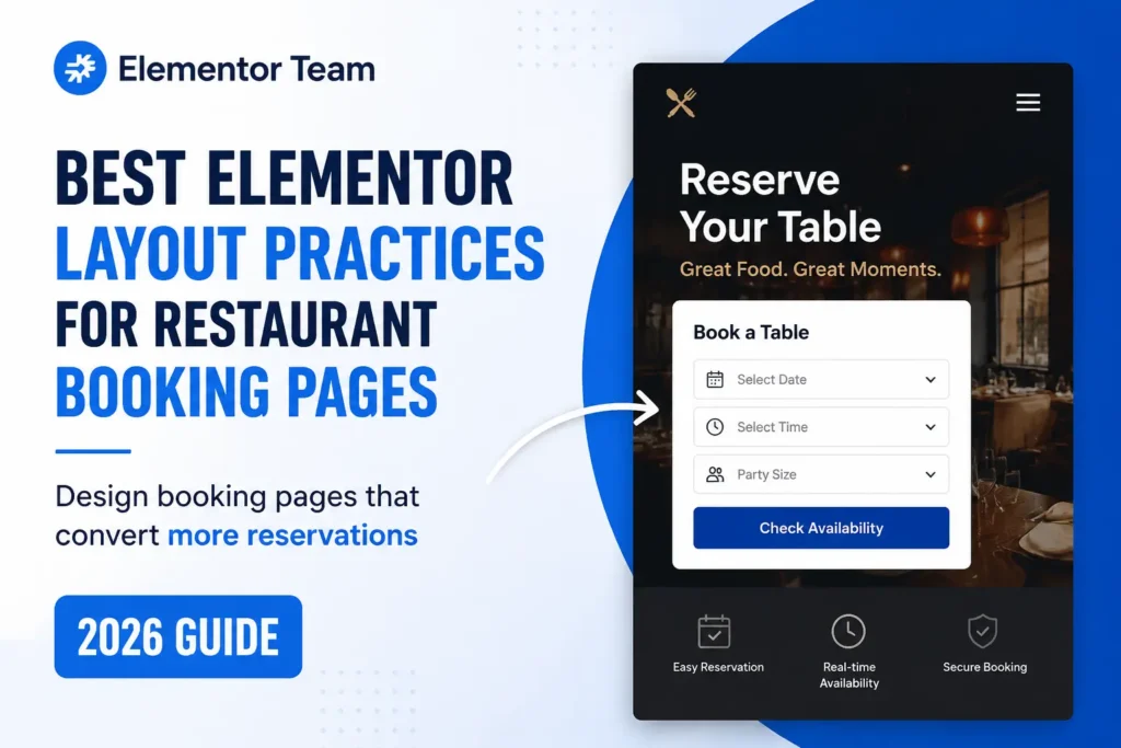
A restaurant’s booking page has one job: turn a hungry person scrolling on their phone into a confirmed reservation. That’s it. Not “look impressive.” Not “showcase the brand.” Just get them from “this place looks good” to “table booked” in as few taps as possible.
Most restaurant websites fail at this — not because the food photos are bad or the branding is off, but because the booking page itself gets in the way. It’s buried under a “Contact” tab. It loads slowly on mobile. It asks for too much information before showing any availability. Or it competes with three other buttons (“Order Online,” “View Menu,” “Join Our Newsletter”) that all fight for the same click.
If you’re building or fixing a restaurant site in Elementor, the good news is you don’t need a custom app or a five-figure build to fix this. You need the right layout decisions, the right widget choices, and a page that respects how people actually behave when they’re deciding where to eat tonight. Here’s how to do it properly.
Why Most Restaurant Booking Pages Lose Reservations
Before getting into layout specifics, it helps to understand where restaurant sites typically leak conversions:
- The reservation button isn’t visible without scrolling
- The booking form is too long or asks for unnecessary details up front
- The page isn’t genuinely mobile-first — it’s just “responsive,” which isn’t the same thing
- Load time is slow, so impatient users bounce before the form even renders
- The booking CTA competes with online ordering, newsletter signups, and social links
- There’s no visible trust signal (reviews, photos, real availability) near the form
Every one of these is fixable in Elementor without touching a line of custom code. Let’s go through the layout, section by section.
1. Put the Reservation CTA Above the Fold — Always
This is the single biggest lever. If a visitor has to scroll to find “Reserve a Table,” you’re already losing them. Most restaurant searches happen on mobile, and diners typically decide within seconds whether a site is worth their time.
In Elementor:
- Use a Hero Section widget with your food or ambience photo as the background
- Add a single, high-contrast reservation button — not a row of three equal-weight buttons
- Keep the headline focused on cuisine and location (“Modern Italian in Downtown Austin”), not a slogan
- If you also offer online ordering, make it visually secondary — smaller button, less saturated color
The reservation button should be the most visually dominant clickable element on the page. If your “Order Online” button and “Reserve a Table” button look identical in size and color, visitors won’t know which one to prioritize, and neither will convert as well.
2. Design Mobile-First, Not Just “Mobile-Responsive”
There’s a real difference between a site that was designed for desktop and squeezed into a phone screen, versus one built mobile-first. Since a majority of restaurant traffic is mobile, this isn’t optional anymore.
Practical Elementor steps:
- Build the mobile breakpoint first, then scale up to tablet and desktop — not the other way around
- Set tap targets (buttons, form fields) to a minimum of 44x44px
- Use a minimum 16px font size for body text so nothing needs pinch-zooming
- Test the sticky header/CTA bar specifically on a mid-range Android phone on a throttled connection — not just your own laptop or a high-end iPhone
- Avoid stacking more than 2–3 widgets vertically before the reservation CTA reappears (use a sticky “Reserve” button in the mobile menu)
A sticky mobile reservation button — pinned to the bottom of the screen as the user scrolls — consistently outperforms a static one buried in a header, simply because it removes the need to scroll back up.
3. Keep the Booking Form Short — Use Progressive Disclosure
Nobody wants to fill out a ten-field form to book a table. The more fields you show up front, the more people abandon before submitting.
Best structure for the initial form:
- Date
- Time
- Party size
That’s it for step one. Everything else — name, phone, email, special requests — should appear only after the user selects an available slot. This is called progressive disclosure, and it works because each additional field feels like a small commitment rather than a wall.
In Elementor, this usually means using a reservation plugin’s shortcode or widget (see the widget section below) inside a Form widget or a dedicated Booking widget, rather than building a giant native Elementor Form with every field visible at once. If you are using the native Elementor Pro Form widget for a simple “request a table” form instead of live availability, apply the same principle: 3–4 fields maximum, and make optional fields collapsible.
4. Choose the Right Booking Integration for Elementor
Elementor doesn’t include real-time table availability out of the box, so you’ll be pairing it with either a WordPress plugin or a third-party reservation platform embedded via shortcode or iframe. The right choice depends on volume and control:
- OpenTable / Resy — best for restaurants that want maximum discovery and don’t mind a per-cover fee. Embed via their official widget or iframe inside an Elementor HTML widget.
- Tock / SevenRooms — better for restaurants that want to own the guest data and avoid per-cover charges, especially once you’re doing consistent volume from your own site.
- WordPress-native plugins (like Amelia, Bookly, or similar booking plugins) — good middle ground if you want the whole flow to stay on your domain and match Elementor’s styling more tightly, since most of these ship with dedicated Elementor widgets.
If you’d rather not manage plugin updates, compatibility, or Elementor styling conflicts yourself, our WordPress booking system service handles the full setup — from choosing the right integration to matching it to your site’s design.
Whichever you choose, embed it in a dedicated, distraction-free section — not squeezed between testimonials and a map. Give the booking widget its own visual breathing room: white space above and below, no competing buttons in the same viewport.
5. Use Real Photography, Not Stock Images
This isn’t just a branding point — it directly affects booking conversion. Diners don’t reserve a table at a restaurant they can’t picture themselves sitting in. Stock photos (or worse, low-resolution phone shots) subconsciously signal “not worth the trip.”
Layout guidance in Elementor:
- Use an Image Carousel or Gallery widget directly above or beside the reservation section — not just in a separate “Gallery” page nobody visits
- Mix dish close-ups with room/ambience shots that include real people (empty dining rooms read as “closed” or “quiet”)
- Compress images to WebP, under ~200KB each, and set explicit width/height attributes to avoid layout shift (this also helps your Core Web Vitals — see next section)
- Add descriptive alt text (“wood-fired margherita pizza at [Restaurant Name]”) — this pulls double duty for accessibility and image SEO
6. Optimize for Speed — Slow Pages Kill Bookings Before They Start
Page speed isn’t a “nice to have” for a booking page — it’s often the actual point of failure. Research consistently shows bounce probability rises sharply as load time increases, and a hungry visitor deciding between three restaurants has zero patience for a slow site.
Elementor-specific speed fixes:
- Disable unused Elementor widgets and third-party addons on the booking page template (Elementor → Settings → Advanced → Experiments, and audit which addon plugins are actually in use)
- Lazy-load all images below the fold; never lazy-load the hero image (it hurts LCP)
- Avoid embedding a heavy third-party booking iframe directly in the hero section — load it slightly below the fold or lazy-load the iframe itself
- Use a caching plugin plus a CDN, and confirm CSS is set to “Internal Embedding” or optimized/minified rather than default external loading of every widget’s CSS
- Test with PageSpeed Insights specifically on the booking page URL, not just the homepage — booking pages with embedded widgets are usually the worst performer on a restaurant site
If you want the full technical breakdown of fixing Elementor-specific Core Web Vitals issues (LCP, CLS, render-blocking CSS), that deserves its own dedicated post — but the four points above will solve the majority of booking-page speed problems on their own.
7. Add Trust Signals Near the Booking Form, Not Just on the Homepage
Trust signals convert better when they’re close to the decision point, not buried elsewhere on the site.
What to place near or inside the booking section:
- A short row of 3–4 star ratings or review snippets (Google, TripAdvisor) with logos
- “X reservations this week” or similar social proof, if your booking plugin supports it
- A one-line reassurance about cancellation policy (“Free cancellation up to 2 hours before”)
- Real operating hours and a click-to-call number directly beside the form, for last-minute questions
In Elementor, this is typically a simple Icon List or Star Rating widget positioned directly above or beside the Booking widget — not in a separate testimonials section three scrolls away.
8. Build In Schema Markup for Reservations
This is where SEO and layout overlap. A well-structured booking page should carry Restaurant and Reservation schema (via FoodEstablishmentReservation where applicable), plus LocalBusiness markup with hours, cuisine, and price range. This doesn’t change the visual layout, but it does affect whether Google — and increasingly AI search tools — can surface your booking availability directly in search results.
If you’re using Elementor with a schema/SEO plugin, confirm the booking page template actually inherits the schema rather than defaulting to generic “WebPage” markup, which is a common gap on custom Elementor templates built outside the main page builder flow.
9. Don’t Let Online Ordering Compete With Reservations
If your restaurant does both dine-in reservations and takeout/delivery, resist the urge to give both actions equal visual weight everywhere. Decide which one is the primary revenue driver for that specific page and design accordingly:
- On the homepage, both CTAs can appear, but one should be visually dominant based on your primary goal
- On a dedicated booking page, online ordering should be a secondary, smaller link — not a second hero button
- On a dedicated ordering page, do the reverse
Trying to serve both goals equally on the same section usually results in visitors doing neither.
10. Handle Group Bookings and Private Events Separately
Standard 2–4 person reservations and 15+ person private event inquiries have completely different conversion paths, and cramming them into the same form hurts both. Large groups need details like budget, event type, and date flexibility that would make a standard 2-top’s booking form feel like a job application.
Best practice: build a separate, dedicated section or landing page for private events and group bookings, linked from the main booking page (“Planning something bigger? Inquire about private events →”). This keeps your primary reservation form fast and simple while still capturing high-value group inquiries through a more detailed form suited to that use case.
Common Elementor Mistakes That Quietly Kill Booking Conversions
A few patterns show up repeatedly on restaurant sites built in Elementor:
- Booking widget buried inside a tabs or accordion widget — anything that requires an extra click to even see the form adds friction that isn’t necessary
- Popup-triggered booking forms on page load — these get dismissed instinctively before anyone reads them; use them for exit-intent at most, never on entry
- Inconsistent CTA copy — “Reserve,” “Book Now,” and “Get a Table” scattered across different buttons on the same page reads as unpolished and can confuse returning visitors
- No visible fallback for sold-out slots — if a time is unavailable, show alternative times or a waitlist option rather than a dead end
- Reservation section styled identically to every other section — no visual separation (background color shift, border, or spacing) makes it easy to scroll past without noticing it’s interactive
Final Thoughts
A restaurant booking page doesn’t need to be flashy — it needs to be fast, obvious, and short. Elementor gives you everything required to build this well: hero sections with a clear CTA, lightweight widgets for trust signals and galleries, and enough flexibility to embed whichever booking system fits your volume. The layout decisions matter more than the design polish. A beautifully designed page with a slow, five-field booking form will lose to a plainer page that lets someone book a table in three taps.
If you’re auditing an existing Elementor restaurant site, start with the above-the-fold CTA and page speed first — those two fixes alone typically account for the largest jump in reservation conversions before you touch anything else.
Need help implementing this? We build and configure WordPress booking systems for restaurant clients — from widget selection to Core Web Vitals-safe integration. Contact Us
Frequently Asked Questions
What’s the best Elementor widget for a restaurant reservation form?
Elementor Pro’s native Form widget works for a simple “request a table” inquiry, but for real-time availability you’ll want a dedicated booking plugin (Amelia, Bookly) or a third-party platform (OpenTable, Resy, Tock) embedded via shortcode or iframe.
Should the reservation button and online ordering button look the same?
No. Pick one primary action per page and give it more visual weight — larger size, higher-contrast color — so visitors don’t have to choose between two equally prominent buttons.
How many fields should a restaurant booking form have?
Start with three: date, time, and party size. Ask for contact details only after the user picks an available slot.
Does page speed really affect restaurant reservations?
Yes — bounce rates rise sharply as load time increases, and booking pages with embedded third-party widgets are often the slowest page on a restaurant site, so they deserve extra optimization attention.
Do I need schema markup on a booking page?
Yes, if you want Google and AI search tools to understand and potentially surface your reservation availability. Use LocalBusiness/Restaurant schema plus reservation-specific markup where your booking platform supports it.