

People visit your course sales page. Some even click the enroll button. But very few finish buying.
It is tempting to change the headline or offer a discount right away. First, find out where people stop. The problem might be on the sales page, at checkout, or after a payment fails.
Here are nine things to check in simple steps.
First, try to buy your own course
Open the page on your phone, as if you have never seen it before. Read it from top to bottom. Tap the enrollment button. Go through checkout using a safe test payment method supported by your platform.
Can you tell who the course is for? Do you understand what you will learn? Can you see the full price before you pay? Does the payment work? Do you receive access and a confirmation email?
Write down every confusing or broken step. Fix those problems before changing colors or adding new sections.
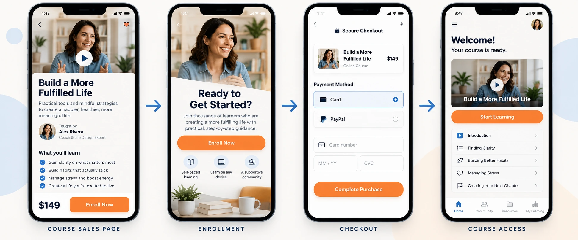
1. Match the page to the reason people clicked
Think about what brought visitors here. Did an ad promise a beginner course, while the page sounds advanced? Did a blog post answer a specific problem, while the course page talks about a much broader topic?
If the message changes too much after the click, people may leave. Look at the ad, email, social post, or article that sends the most visitors. Make sure the first screen of the course page clearly continues that message.
What to fix: Say what the course teaches, who it is for, and what a learner can do after completing it. Keep the claim specific and realistic.
2. Tell people who the course is for
A page that says “Learn everything about marketing” leaves too many questions. Is it for a complete beginner? A small business owner? Someone who already runs ads?
Add a short “This course is for you if…” section. You can also say what knowledge or tools learners need before starting. This helps the right people recognize themselves and saves the wrong people from buying a poor fit.
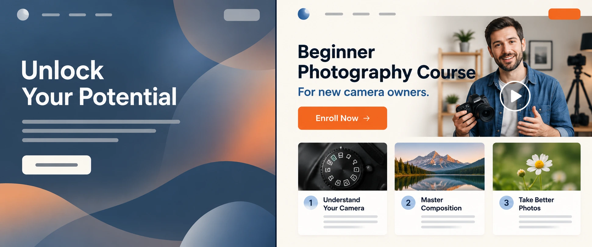
3. Show what is inside the course
Visitors should not have to guess what they are buying. Show the main modules, the type of lessons, any exercises or resources, and how access works. If there are live sessions, explain when they happen. If lessons are recorded, say that plainly.
You do not need to list every minute of video. Give enough detail for someone to understand the learning path. A short sample lesson or preview can help if it represents the real course.
What to fix: Add a readable outline and explain what a learner will actually do in the course.
4. Make the price and terms clear
People may click “Enroll” just to find the price. If extra fees, tax, or recurring payments appear only at checkout, that can stop them.
Show the price, currency, what is included, and whether the payment is one time or recurring. Explain any refund terms, access period, and payment plan before checkout. Make sure the wording matches the actual payment settings.
Do not promise a refund or lifetime access unless the course really offers it.
5. Use real proof that helps people decide
Learners want to know whether the course is taught by someone who knows the subject and whether the material will be useful to them. A clear instructor bio, a sample lesson, and genuine student feedback can help.
Use only real testimonials with permission. Avoid fake reviews, invented student numbers, and promises of jobs, income, or results that you cannot support. For courses marketed in the United States, the FTC says endorsements and advertising claims should be truthful and not misleading. FTC endorsement guidance.
6. Make the enroll button easy to find
One button at the very top may not be enough for someone who needs to read the details first. Add an enrollment button after the course outline, after the price, and near the end of the page.
Use clear wording, such as “Enroll in the course.” Keep the price and key terms close to the button so the visitor knows what they are choosing. Every button should lead to the correct checkout, not a broken page or the wrong course.
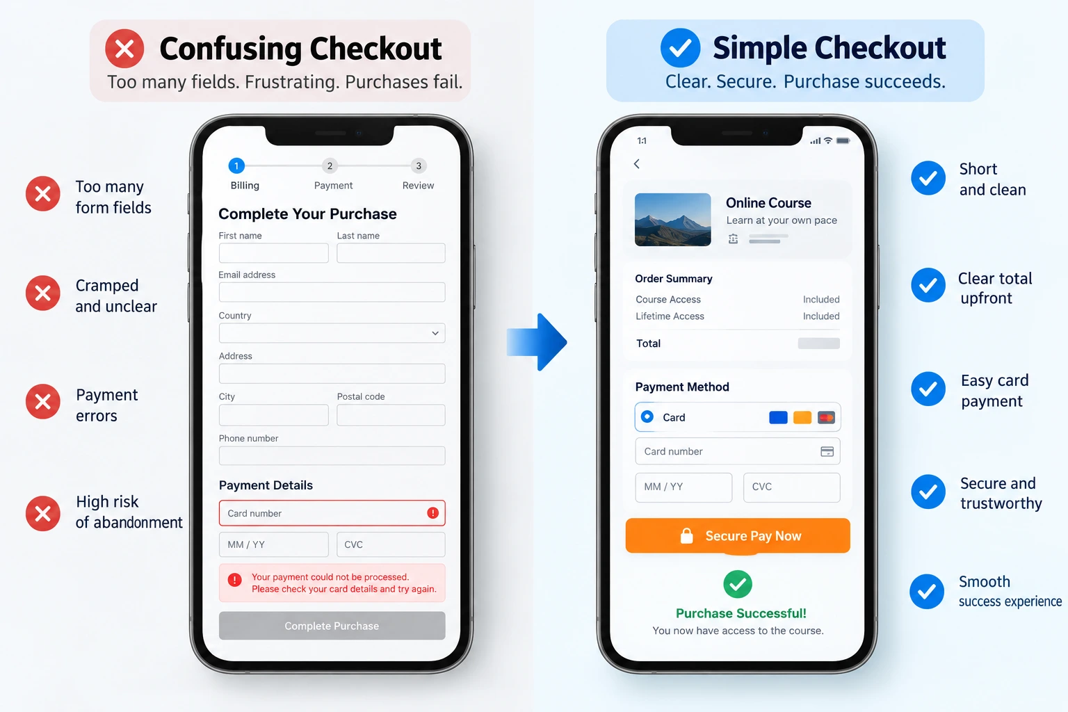
7. Check checkout on a real phone
Sometimes the sales page works, but checkout does not. Common problems include a coupon field that distracts people, a payment option that fails, a confusing account requirement, or a form that is hard to complete on mobile.
Try the whole process with test orders on the devices and payment methods your learners use. Check validation messages, payment errors, confirmation emails, and access to the course after purchase. If your platform allows it, ask only for the information needed to complete the order and provide access.
8. Answer the questions people have before paying
Add a short FAQ based on real questions from your audience. Good questions might include: How long does the course take? Can I learn at my own pace? Do I need prior experience? When do I get access? Is support included? What happens if I need help?
Answer honestly. If there is no personal support or certificate, do not suggest otherwise. A clear answer can remove uncertainty without pushing people.
9. Measure where enrollments stop
Separate page visits, enroll-button clicks, checkout starts, successful payments, and course access. A click on “Enroll” is not a sale. If many people start checkout but few pay, test checkout first. If few click the button, review the offer and sales page.
Google Analytics recommends ecommerce events including begin_checkout and purchase for measuring this path, but the events need to be set up correctly on your site. Google Analytics recommended events.

What should you fix first?
Start with anything that prevents a purchase: broken buttons, failed payments, unclear price, or missing course access. Then work on the message. Make it easy to see who the course helps, what is included, and what happens after payment.
After each change, check completed enrollments. A busier page or more button clicks will not help if learners still cannot finish buying.
Need help with your course sales page?
Elementor Team can review the page, mobile layout, enrollment buttons, checkout, and tracking. We can help you see where people get stuck and make the buying process clearer.