

People are visiting your law firm’s website. But your phone is quiet, and consultation requests are rare.
That does not always mean your website needs a complete redesign. A visitor may have one question your page never answers. They may not see how to contact you. Or your form may fail when they try to send it.
Here are nine things to check, in the order a potential client is likely to see them.
First, try to contact your own firm
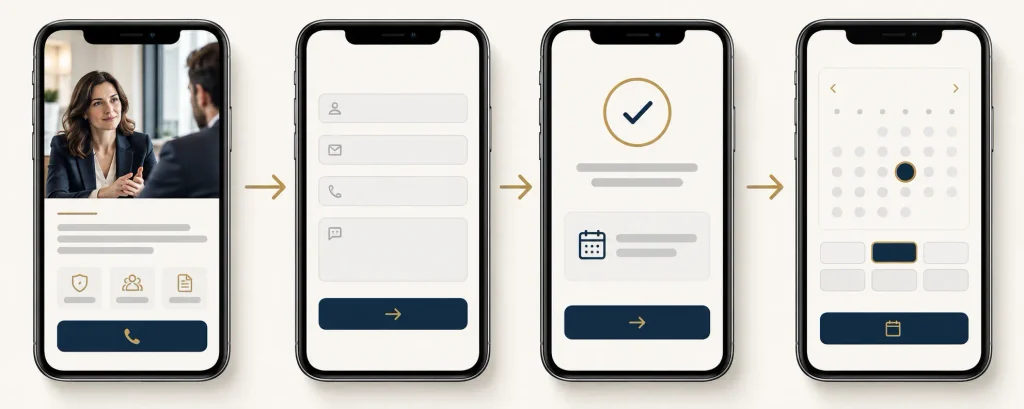
Open your website on your phone. Imagine you have a legal problem and know nothing about your firm. Find the right page, try the phone link, and send a test message through the form. If you offer online booking, try to book a time too.
Ask yourself: Can I tell whether this firm handles my problem? Can I find out where it works? Do I know what happens after I contact it?
Send a test request with a clearly marked test name. Check that the confirmation appears, the notification reaches the right inbox, and someone can reply to the message. Do not send real client details in a test.
Image 1 placement: Put the consultation journey image here.
1. Check whether visitors need your services
Traffic can look healthy even when it brings the wrong people. A blog post might attract students or people researching a law topic in another state. Those visits will not necessarily turn into consultations.
Look at the pages people enter first. Are visitors landing on pages about cases your firm takes? Are they in places where your lawyers can help? Does each useful blog post lead to the relevant service page?
For example, a post about divorce paperwork should help a reader find the family law service page, if that is a service the firm actually offers.
What to fix: Link each relevant article to the matching service page with a plain sentence such as “Need help with a divorce matter in [location]? See how our family law team works.” Only use that wording if it is true for the firm.
2. Say what you do and where you work
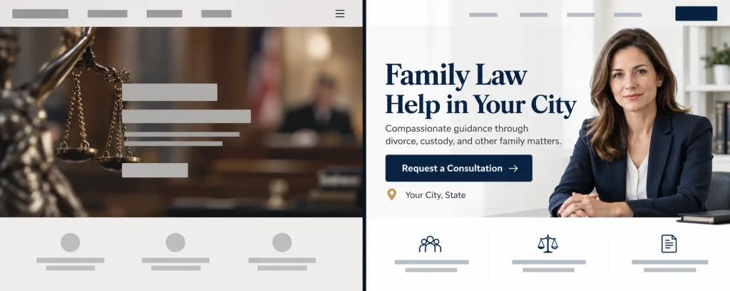
“Experienced legal solutions” says very little to a worried visitor. They want to know whether you handle their problem and serve their location.
Near the top of the page, state the practice area, who it is for, and the location you serve. Use the terms clients know. “Help with car accident claims in [city]” is easier to understand than a broad promise about legal excellence.
Do not claim to serve a place or handle a case type unless the firm actually does.
Image 2 placement: Put the unclear versus clear service-page image here.
3. Make the next step obvious
Some legal websites explain a lot but never say what the reader should do next. Others have one small “Contact” link hidden in the menu.
Choose a clear action such as “Request a consultation” or “Call our office.” Put it near the top of the page and again after useful sections. On a phone, the number should open the dialer when tapped.
If consultations have a fee, or if availability is limited, say so plainly. Do not label a consultation “free” unless it really is.
4. Explain what happens when someone contacts you
People may hesitate because they do not know whether they will speak with a lawyer, how long the first call takes, or what information they need to share.
Add a short note beside the form or booking button. For example: “Tell us the type of help you need. Our team will review your message and explain the next step.” Include a real response window only if the firm can consistently meet it.
Avoid promising that submitting a form creates an attorney-client relationship. Have the firm review any intake notice or disclaimer for the places it practices.
5. Make the form short and test it
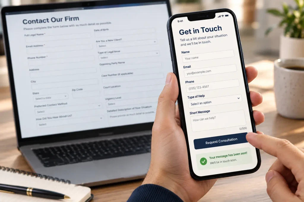
A long form can feel like paperwork before the visitor has even spoken to anyone. Start with the details your team needs to decide how to respond: name, contact details, general issue type, and a short message. Ask for sensitive documents later through an appropriate secure process.
Test the form on a phone. Check required fields, error messages, spam protection, confirmation, and inbox delivery. Make sure labels are clear and a visitor can correct a mistake without starting over. W3C guidance recommends clear labels and useful error feedback for forms. Source: W3C forms guidance.
Image 3 placement: Put the simple intake-form image here.
6. Give people a reason to trust the firm
A person facing a legal problem may want to know who will handle their inquiry. Show the real attorneys, their roles, office location, and practice areas. Explain how the firm works in everyday language.
Use genuine client reviews and case information only with proper permission and careful review. Never add made-up awards, results, testimonials, or guarantees. In the United States, the ABA’s model rule says lawyer communications must not be false or misleading; local rules can add requirements. Source: ABA Model Rule 7.1.
7. Check the entire page on a phone
Visitors should be able to read the text, tap the call button, and finish the form without zooming in or hunting for a link. Check for pop-ups that cover the page, small tap targets, and a booking calendar that does not fit the screen.
Open each important service page on a real phone. Tap every button. Scroll to the bottom. Try the form and booking tool there, not just on the homepage.
8. Answer the questions that stop people from calling
A service page should answer basic questions before asking for contact details. What types of matters does the firm take? Where does it work? What happens during the first conversation? Is there a consultation fee? How can someone reach the office?
Answer only what the firm can verify. Legal outcomes depend on the facts of each case, so avoid promises about what a client will win or receive.
9. Track real consultation requests

Page views alone do not tell you whether the website is helping the firm. Count submitted inquiry forms, completed bookings, and calls that came through the site. Keep the measures separate so you can see where people stop.
If you use Google Analytics, set up a specific event for the form you care about and test it. A button click is not the same as a successful submission. Google’s guidance explains how to measure a specific form as a key event. Source: Google Analytics Help.
Image 4 placement: Put the visitors-to-consultations image here.
What should you fix first?
Start with anything broken: phone links, forms, booking pages, or notifications. Then improve the pages with the most relevant visitors. Make the service and location clear, explain the first step, and give people an easy way to reach the firm.
Make one change at a time when you can. Watch whether completed consultation requests improve, not just whether more people click a button.
Need help with your law firm website?
If people visit your law firm website but do not get in touch, Elementor Team can review the contact path, service pages, mobile layout, and forms. We can help you find where visitors get stuck and make the next step easier to take.