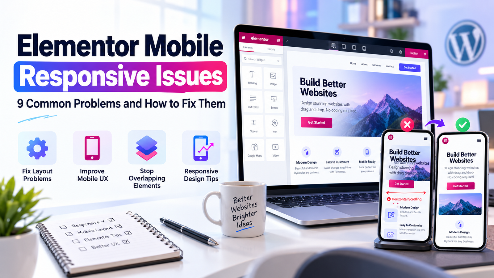
Your Elementor website might look perfect on a desktop but completely different on a smartphone. Text overlaps images, buttons become difficult to tap, and sections extend beyond the screen.
These problems can frustrate visitors, especially when they are trying to contact your business or book a service.
The good news is that many Elementor mobile responsive issues can be fixed without rebuilding your entire website.
Here are nine common problems and practical ways to resolve them.
1. Fix Horizontal Scrolling on Mobile
Horizontal scrolling happens when an element extends beyond the viewport.
Common causes include:
- Fixed-width containers
- Oversized images
- Negative margins
- Long text or URLs
- Custom CSS with large pixel values
Open your page in Elementor and switch to mobile preview. Inspect any container that appears wider than the screen.
Use responsive widths, review padding, and check whether a child element has a minimum width that prevents it from shrinking.
Avoid applying overflow-x: hidden as your first solution. It can hide the symptom without fixing the element causing it.
2. Adjust Mobile Typography
Large desktop headings often wrap awkwardly on smaller screens.
In Elementor, select the heading widget and open Style > Typography.
Switch to the mobile breakpoint and adjust:
- Font size
- Line height
- Letter spacing
- Text alignment
For example, a heading that uses 56px on desktop might need a smaller size on mobile. The correct value depends on the font, content, and available space.
Check your text on actual devices rather than relying on a single preview width.
3. Fix Overlapping Sections
Overlapping sections often result from excessive negative margins, absolute positioning, or fixed heights.
Inspect the affected container and review its Advanced settings.
Remove unnecessary negative margins and check whether elements use absolute positioning.
Whenever possible, allow containers to grow naturally with their content.
4. Make Buttons Easy to Tap
Small buttons are harder to use on a touchscreen.
Review button padding, font size, spacing, and alignment.
A good mobile button should have a clearly visible label and enough space around it to avoid accidental taps.
Test important actions such as:
- Request a Quote
- Contact Us
- Book an Appointment
- Add to Cart
These buttons directly affect whether visitors can complete important tasks.
5. Fix Images That Look Cropped
An image that looks good on desktop may lose its subject on mobile.
Check whether you are using an image widget or a background image.
For background images, adjust the background position and container height at the mobile breakpoint.
If the image contains important details, consider using a dedicated mobile crop.
6. Check the Mobile Navigation Menu
A broken mobile menu can prevent visitors from reaching your service pages.
Test whether the menu opens, links work, dropdowns expand, and the menu closes correctly.
Also inspect the header’s z-index, particularly when a sticky header overlaps other content.
7. Review Tablet and Custom Breakpoints
Fixing only desktop and mobile layouts can leave tablet users with a poor experience.
Review every enabled breakpoint in Elementor.
Pay attention to columns, flex directions, minimum widths, and navigation behavior.
Make sure custom CSS media queries do not conflict with Elementor’s responsive settings.
8. Clear Cached CSS After Changes
Sometimes Elementor changes look correct in the editor but not on the live website.
Possible causes include cached HTML, generated CSS, or optimization settings.
After saving, try clearing the Elementor-generated files and data using the tools available in your installed version, then clear your website and CDN caches.
Avoid clearing or disabling optimizations blindly on a live store without checking the effects.
9. Test Your Website on Real Devices
Elementor’s responsive preview is useful, but it cannot reproduce every browser behavior.
Test your website on different screen sizes and browsers.
Focus on important visitor journeys:
- Open the homepage.
- Navigate to a service page.
- Click a call-to-action button.
- Complete the contact form.
- Confirm the submission works.
A website is not fully responsive simply because its sections fit the screen. Visitors must also be able to use it comfortably.
When Should You Hire an Elementor Expert?
A few spacing problems are usually manageable.
However, widespread layout issues, conflicting custom CSS, broken templates, or problems caused by third-party plugins may need professional troubleshooting.
At Elementor Team, we help businesses identify and resolve Elementor layout issues without unnecessary redesigns.
Explore our WordPress Support & Fixes service if your website needs technical attention.
Frequently Asked Questions
Why does my Elementor website look different on mobile?
Desktop layouts use different available widths, and some design settings may not adapt automatically. Fixed dimensions, margins, font sizes, and positioning are common causes.
Can Elementor create different mobile layouts?
Yes. Elementor provides responsive controls, and some layouts can be adjusted or selectively displayed at different breakpoints.
Why are my Elementor changes not showing on mobile?
Caching, generated CSS, and browser differences are possible reasons. Confirm the changes were published before troubleshooting further.
Will fixing mobile responsiveness improve SEO?
Mobile usability is important for visitors and may support a better overall website experience. However, fixing a layout alone does not guarantee higher rankings.